Exposing contact patternsPublished: June 13, 2008 SocioPatterns.org aims to shed light on hidden patterns in social dynamics. A case in point is the study of contact patterns, which deals with such patterns in contacts among people. To date, little is known about these patterns. Although models can help in learning more, measuring real-world dynamics is indispensable for obtaining a complete picture. However, doing so manually is both laborious and intrusive, and tends to produce unreliable data – yet until recently it was the sole option we had. Fortunately, emerging technologies such as active RFID devices offer previously unfeasible means for collecting this much needed data. While collecting data is the first step, making sense of the resulting large amounts of data is the next. This is where insightful visualizations come into play, as these can expose otherwise invisible features and regularities. The following movie gives an impression of a first contact patterns experiment and visualization we have been working on. It is followed by a detailed description. Experiment set-upWe have been working on an experimental set-up in which we aim to measure the contact patterns of a group of people. To do so we asked volunteers to wear small tags with integrated active RFID technology, henceforth called the beacons. These beacons continuously broadcast small data packets. These packets are received by a number of stations and relayed through a local network to a server for further processing. The stations are installed in fixed locations in the environment. The beacons and stations we used were created by and obtained from OpenBeacon.org.
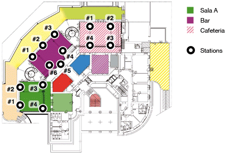
Schematic overview of the interactions between the beacons, the stations, and the server. A first medium-sized test deployment of this experimental set-up took place recently (26-29 May, 2008) during the workshop “Sociophysics: status and perspectives” in Villa Gualino, in Turin, Italy. The workshop presentations took place in Sala A, while the participants lingered in the Bar during breaks, and had lunch in the Cafeteria. All three areas were covered by at least four stations each, as shown on the map below.
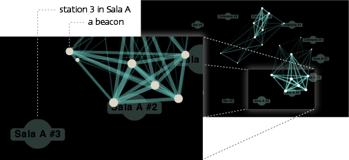
Map of the placement of the stations in Villa Gualino. The packets from up to 50 beacons were collected continuously for about 75 hours at an overall rate of up to 100 distinct packets per second. In total about 25 million packets were collected, corresponding to about 200 Mb of compressed raw data. On-line data analysis and visualization serverIn addition to recording data for further analysis – whose results will be posted here in the future – we also developed a real-time visualization system to display some aspects of the observed dynamics. Our visualization involves a server component and a client component. The server component processes the beacon packets relayed by the stations. These packets are typically received by multiple stations at varying strengths. These reception patterns can be used as a proxy for the physical proximity of two beacons. A related technique is used in the geo-location feature of the Apple iPod Touch and iPhone, or in services like PlaceEngine. All calculations are performed in real-time over a sliding window of about two minutes. The post-processed data are dispatched to the visualization client at regular intervals, as an XML stream. The on-line data collection and analysis system is entirely coded in Python on top of the Twisted framework and the Numpy library. Visualization clientThe main visualization represents the beacons, the stations, and their relations of proximity as measured by the system. The beacons are shown as simple discs, which are optionally labeled. Two beacons are connected by a link if the system detected that they are close to each other. The length, thickness and transparency of a link are a function of the strength of the link: short, thick and more opaque links represent strong proximity; thin, transparent links indicate weak proximity. The size of the discs representing the beacons depends on the number and proximity of other beacons, and specifically is a function of the sum of link weights to other beacons. The stations are shown as labeled shapes and laid out in a circle that spans the main view. The size of these shapes varies according to the number of beacons that are close to them.
Stations and beacons in the main visualization view. While the stations are laid out at fixed positions, the beacons are not. The network of their proximity relations is laid out by using a force-based model. Beacons repel each other, and the link between two beacons acts as a spring pulling them close to each other. The stiffness of the spring increases with the proximity of beacons. Beacons are also pulled towards the stations that see them more often, so that groups of nearby beacons are laid out in the vicinity of the stations that is closest to them. The result is a first attempt to obtain a rather abstract yet comprehensive visualization of the proximity dynamics. The movie at the top of this post contains a time-lapse playback of the most interesting periods of one day of the workshop. Visualization client interfaceThe visualization client is an Adobe Air application developed in Flex. The visualization and physics system use (a mildly modified version of) the flare visualization toolkit. The application interface involves a visualization window, a control panel and a number of auxiliary windows. The visualization itself can be shown full-screen during presentations. The control panel provides various interfaces to manage the data-sources, the visualization and the physics engine. The data source is either the server component for real-time visualizations, a simulation for off-line testing, or data files for time-lapse playback. When using a simulation, an additional window is provided in which the simulated stations and beacons are shown. When in time-lapse mode, one can activate the recorder, which saves a bitmap file for each rendered frame. These saved frames were for example used to create the movie at the top of this post. The complete interface of the visualization client, including the simulation window. Creditsvisualisation: Wouter Van den Broeck data analysis: Ciro Cattuto music: Maps and Diagrams – Siaptik – Recorded by Tim Martin experiment set-up: Alain Barrat, Ciro Cattuto, Vittoria Colizza, Daniela Paolotti, Jean-François Pinton, Wouter Van den Broeck, and Alessandro Vespignani thanks to: Santo Fortunato, ISI administration, Ezio Borzani, Milosch Meriac (openbeacon.org), and the workshop participants sponsoring institutions: Institute For Scientific Interchange Foundation (Torino, Italy), Laboratoire de Physique de l’École Normale Supérieure de Lyon (Lyon, France) |
NEWS |
![SocioPatterns [logo]](http://www.sociopatterns.org/wp-content/themes/sp2/images/header_logo.png)

